This tutorial was made using Paint Shop Pro 9, but the process is exactly the same in PSP 8 and probably in earlier versions.
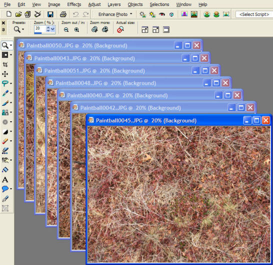
Open all the images. At this point they are still full resolution. Here is PSP with the seven source images I am using for this tile set. It is an open field left to grow wild, in winter so many of the plants have a dried-up, bleached out look, and there are still fall leaves on the ground. The pictures are titled "Paintball" because I took them while I was playing... well, strictly speaking, when I was not playing, because I had been shot. I take my camera everywhere!
How many images do you need? How many tiles should be in a set? It depends how uniform your images are. If you want a perfectly uniform floor, you only need one. If you want a very uneven natural or naturalistic texture, having only a few tiles will create obvious repetition, and you should have more. With photo-based textures, I usually aim for eight tiles, but sometimes do as few as five or as many as fifteen. Most non-photo textures need fewer. The Dundjinni art pack tiles have only four per set.
Okay... let's get to work. The first step is to make the images square and all the same size. Use the menu option Image/Canvas Size to cut them down to a uniform, square size. You should be keeping them big at this step, this step is to make them square, not to shrink them.
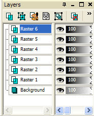 |
Copy one image (CTRL-C) and paste it into a new image (CTRL-V). Now, copy each of the other images and paste them as new layers in the same image (select the new image and then CTRL-L). You'll end up with a single image with as many layers as you have images, like a stack of photographs. Your layer palette (on the right side of the screen) will look something like the image to shown to the left. This layer palette shows seven layers. The original image is "Background" and the others were added as "Raster 1" through "Raster 6". The selected layer ("Raster 6") is the one that any changes will affect (drawing on the image, adjustment tools, etc). You can select a layer by clicking on it. Selecting the layer doesn't change what the image look like, it just changes where you are working. You can draw in the middle of the stack, you just might not be able to see it. |
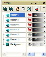 |
In this case, none of the layers are transparent, so only the top one is visible in the image. We're going to need to see other layers, and we'll do it by hiding the ones we don't want to see. Click on the eyeball icon next to each layer's name, and a red X will appear over the eyeball, and the layer will be hidden. The layer palette will look like the image to the right.
So far, none of these images will tile. (If you're dealing with tiling textures, the textures may tile, but not together, so keep following along.) Our next job is to make a single tiling image, which we will use to make a "frame" around all of the images. Because all of the tiles in our final set will share the same "frame", they will tile together.
Pick one of the images to make into your tiling frame. It should be a fairly uniform image. If some of your images have very distinct elements at their edges (especially bright objects like a rock or bright leaf), those aren't the best ones to choose. Also, if you use photos, your images may vary a bit. Pick one that seems typical of your set. The closer your frame is to your other images, the better.
Select the layer, copy it (CTRL-C), and paste it into a new image (CTRL-V).
If you have a bright or distinctive object near the border of the image you want to use, you can use the clone brush to fix it now. This is why we're still working with full resolution images rather than reducing them to the final size — the reduction will help cover up any fixing we had to do. If the distinctive objects are in the middle of the image, they won't matter anyway, so don't waste time on them. Only the edges matter.
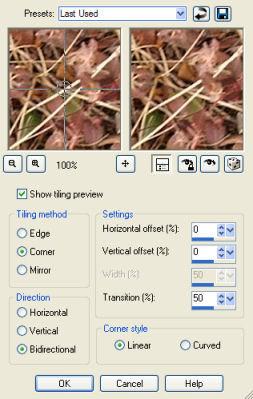
Once you've picked your image and, if necessary, touched it up, make it into a seamless tile. Paint Shop Pro makes this easy; just go to Effects/Image Effects/Seamless Tiling. The dialog looks like the image to the right. Direction must be set to Bidirectional (tiling in both the horizontal and vertical direction), the rest you can safely experiment with. Usually it won't matter. Hit OK when you're ready. |
 |
Copy the resulting image (CTRL-C again), go back to original image with all the layers, select the top layer in the layer palette, and paste as a new layer (CTRL-L). (If you don't select the top layer in the layer palette, you'll end up pasting the new layer in the middle of your stack of layers, and need to move it to the top. You can drag it to the top and drop it there.)
I like to rename the layer "frame", to make it obvious which is which. You can do this by right-clicking on the layer and picking Rename.
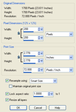
Now is time to resize the image to 200x200. Go to Image/Resize. Select a width and height of 200 pixels (make sure it's set for pixels, not percent). You can completely ignore the print size settings here. "Resize all layers" should be checked. The Resize dialog should look something like this: After you've resized, hide all the layers besides the "frame" (by clicking on the eyeball icons next to them in the layer palette so they're X'ed out) and make sure "frame" is the selected layer. |
 |
 Use
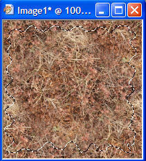
the freehand selection tool to make an uneven outline inside your image. The
Freehand selection tool looks like a lasso. The Selection Type
should be Freehand (there are some other great settings
here for cutting out objects, but we'll leave that for another tutorial). I
prefer to set Feather to 0 and then feather in the
next step, since Feathering here will be outside feathering and it is easy to
accidentally go all the way to the edge. For photographs, it is very helpful
to make your outline irregular, as it helps hide the transition line. If you
have a more uniform texture as your source image, you can get away with a simple
rectangle and do your feathering here in the same step (set Feather to 10).
Use
the freehand selection tool to make an uneven outline inside your image. The
Freehand selection tool looks like a lasso. The Selection Type
should be Freehand (there are some other great settings
here for cutting out objects, but we'll leave that for another tutorial). I
prefer to set Feather to 0 and then feather in the
next step, since Feathering here will be outside feathering and it is easy to
accidentally go all the way to the edge. For photographs, it is very helpful
to make your outline irregular, as it helps hide the transition line. If you
have a more uniform texture as your source image, you can get away with a simple
rectangle and do your feathering here in the same step (set Feather to 10).
If there are distinctive objects or areas near the ege of your image, try to keep them inside the selection. Go around them if you have to. That will help keep them out of your tiles.
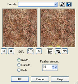
We are going to delete the area inside the selection, but we don't want a sharp edge where we deleted. Instead, we will "feather" the selection so it fades out. I prefer to use Selections/Modify/Inside-Outside Feather (rather than feathering in the preceding step). Set it for Inside feather and an amount of 10, as shown here:
Then click OK.
Now, delete by hitting the delete key! Your image will look something like this:
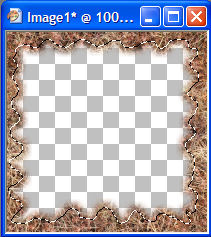
All the white and gray squares indicate transparent regions. If you don't see them, you probably have not hidden all the layers under your frame, so you are seeing one of those layers instead of the squares. (If your actual texture is white or gray, you may want to use a different color to show transparency; the setting is under File/Preferences/General/Transparency and Shading.) We are going to show the other images underneath this frame, so they will show in the transparent middle, while this frame is going to cover them at the edges.
Unselect your selection by going to Selections/Select None.
Go through your layers and, keeping the "frame" showing, show them one at a time (by clicking on the eyeball icon in the layer palette). Do any of them contrast with the frame? If so, select that layer and you can adjust it. For example, I often have some images that are lighter or darker than the frame. If I left them this way, there would be light or dark spots when I used these for the floor. Instead, I select the offending layer, and adjust the brightness/contrast (Adjust/Brightness and Contrast/Brightness-Contrast or just hit SHIFT-B) until I am satisfied with the result. Adjustments will only affect the selected layer, not the whole stack. Getting the right brightness and contrast settings is a trial-and-error process. Occasionally I also need to adjust the Saturation (for example, if one image is darker, it may look "washed out" when you lighten it, and need to also have the Saturation increased). You can find this on Adjust/Hue and Saturation/Hue-Saturation-Lightness or SHIFT-H.
Once you're happy, it's time to save. File/Save As, and use the pspimage format. This preserves all the layer information (PNG format doesn't), so if you later decide to make a change to the whole set, you can. Give it a name that is descriptive and likely to be unique. If you're going to share your tiles, this makes them much more useful for other people. For example, I could have called this "field" or "grass" but that doesn't distinguish it from other tiles. Instead I'm calling it "field_winter", so that it is sorted with other "field" type tiles but is differentiated. General description first, then specific details. Also, I'll add my initials (jhd) to guarantee it has a different name than everyone else's tiles. The final name is "field_winter_jhd.pspimage".
Now we'll save the actual files that Dundjinni will use. One at a time, show each layer (keep the frame showing), and Save As in PNG format. (Hint: if you start at the bottom, you don't have to hide each layer again afterwards.) Add -a, -b, etc to each one. For example, this set will be "field_winter_jhd-a.png", "field_winter_jhd-b.png", etc. This tells Dundjinni that these pictures are part of a single tile set.
| I like to test the image here, before taking it to Dundjinni. Close your image, and then open all the PNG files you just made. Copy one of them into a new image (CTRL-C and then paste with CTRL-V). I use a new image so I don't accidentally overwrite one of my PNG files. Change the canvas size (Image/Canvas Size). Since we have 7 images in this set, we're going to tile them 3x3, so we want a canvas of 600x600, with the original image in the center. If I had 4 tiles, I would make a 400x400 canvas with the image in the corner; if I had 5 or 6, I would make it 600x400 with the image in the upper middle. Use the arrows at the bottom of the Canvas Size dialog to control where the image will end up. The center button will make it end up in the center; the arrow pointing to the top left will make it end up in the top left, etc. If your images are mostly white (e.g. you're doing snow textures), you may also want to change the background color to something that contrasts better. | 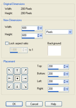 |
One by one, copy each image and paste it as a new selection into the 600x600 image (CTRL-E). You can use the Move tool to get it lined up just right. Be smart about it: you start with the image in the center that you can use to line up the others. I'll put the next one directly above it, then directly to the right, then below, then in the corners. That way I always have something to use as a reference so I get it lined up right. In this image, I've just placed the image above and can still use the Move tool (which is selected) to shift it:
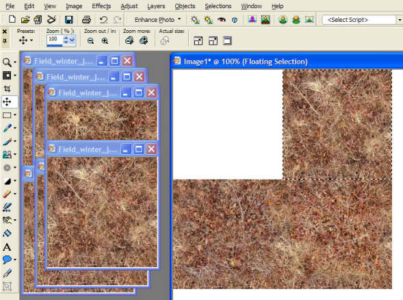
This is a little tedious, but it allows you to spot any annoying artifacts or objects that look repetitious. You can still edit your tiles if you need to. You could also just load your tiles in Dundjinni, but then you have to wait for it to start up, and if you need to edit your tiles, you have to close it, change them, and restart it again.
If you don't have exactly the right number of tiles to fill the space, just repeat some. Since I have seven tiles and space for nine, two get repeated.
If you like the overall effect, I suggest saving the test image as a JPG file. When you upload it to the forums, you can post the test image and then put the tiles in a zip file, saving people time when they download, and letting them see how well your tiles work together.
Here's the top part of my result (6 tiles worth). Pretty good, you can tell which tile is which if you look hard but the overall effect is uniform:
